
Redesigning the website of Simyo to increase convertion rates and reflect better the values and identify of the company.
Role: UX/UI Designer
Duration: 1 day
Responsibilities: UX Research, UX Design, UI Design, Prototyping
Challenge
Project Scope
This project aims to redigning the website of Simyo in order to make navigation more intuitive and user-friendly, ensure that the design reflects Simyo's values, including affordability, transparency and flexibility, and lastly increasing conversion rates by optimizing its structure and design.
Problem Statement
Simyo customers have trouble navigating the website and as a result, find some simple tasks very complicated or turn to customer service for help. In both cases they end up frustrated and leave the website.
Hypothesis
By reconstructing the information of the homepage, applying heuristics and making it easier to navigate by exploring the different options through some new features, I assume that there will be a boost in conversion and therefore Simyo will retain the existing customers but also attract new ones.
Who is Simyo?
Simyo is a telecommunications company operating in Europe, that specializes in offering simple and affordable mobile phone services.
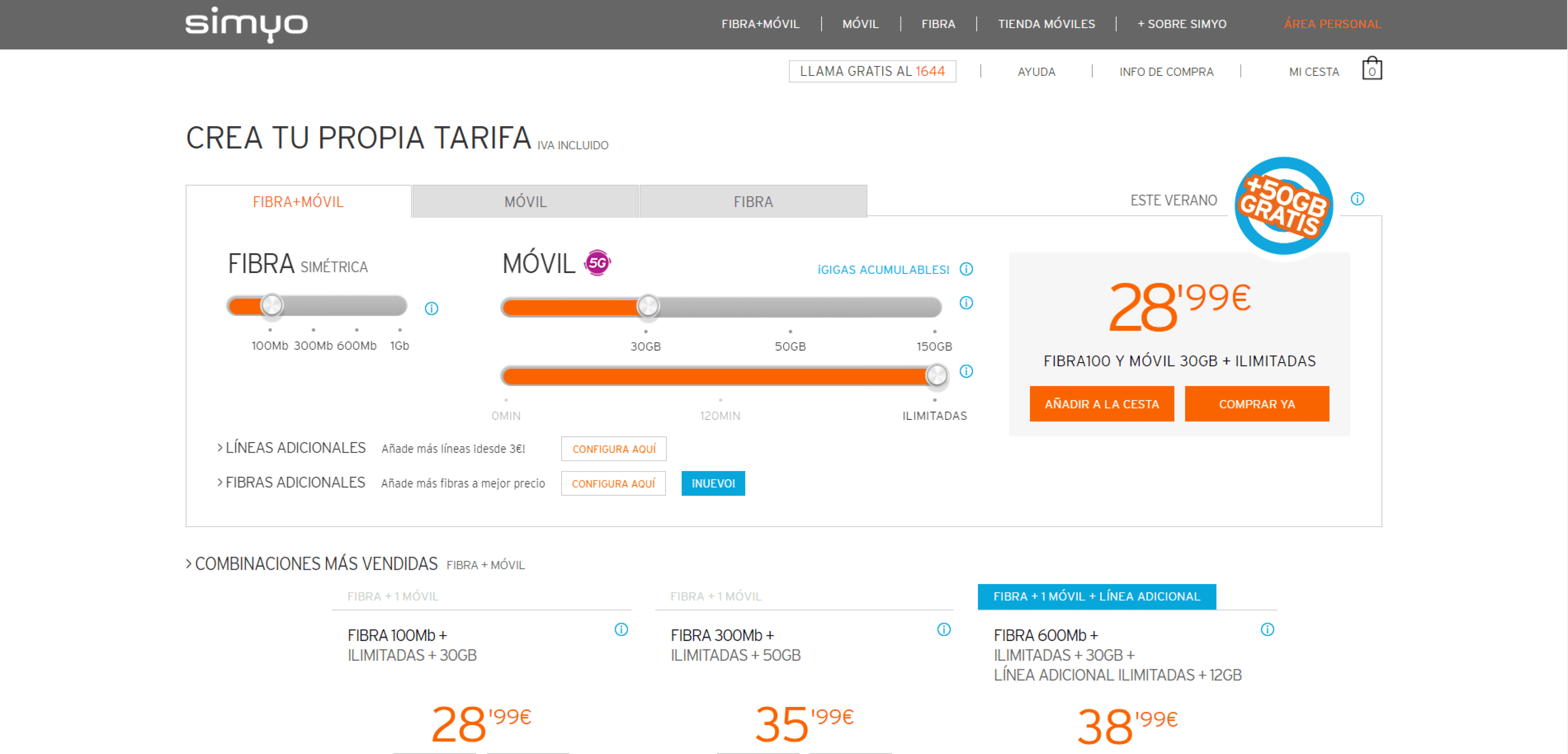
This how the current website looks like

Research
Reviews
To better understand how Simyo customers feel and spot potential issues, the first thing I did was to look at customer reviews online on Trustpilot.com.
I already knew the company's values and how it wants to be perceived, and I wanted to better understand if customers really had the same opinion.
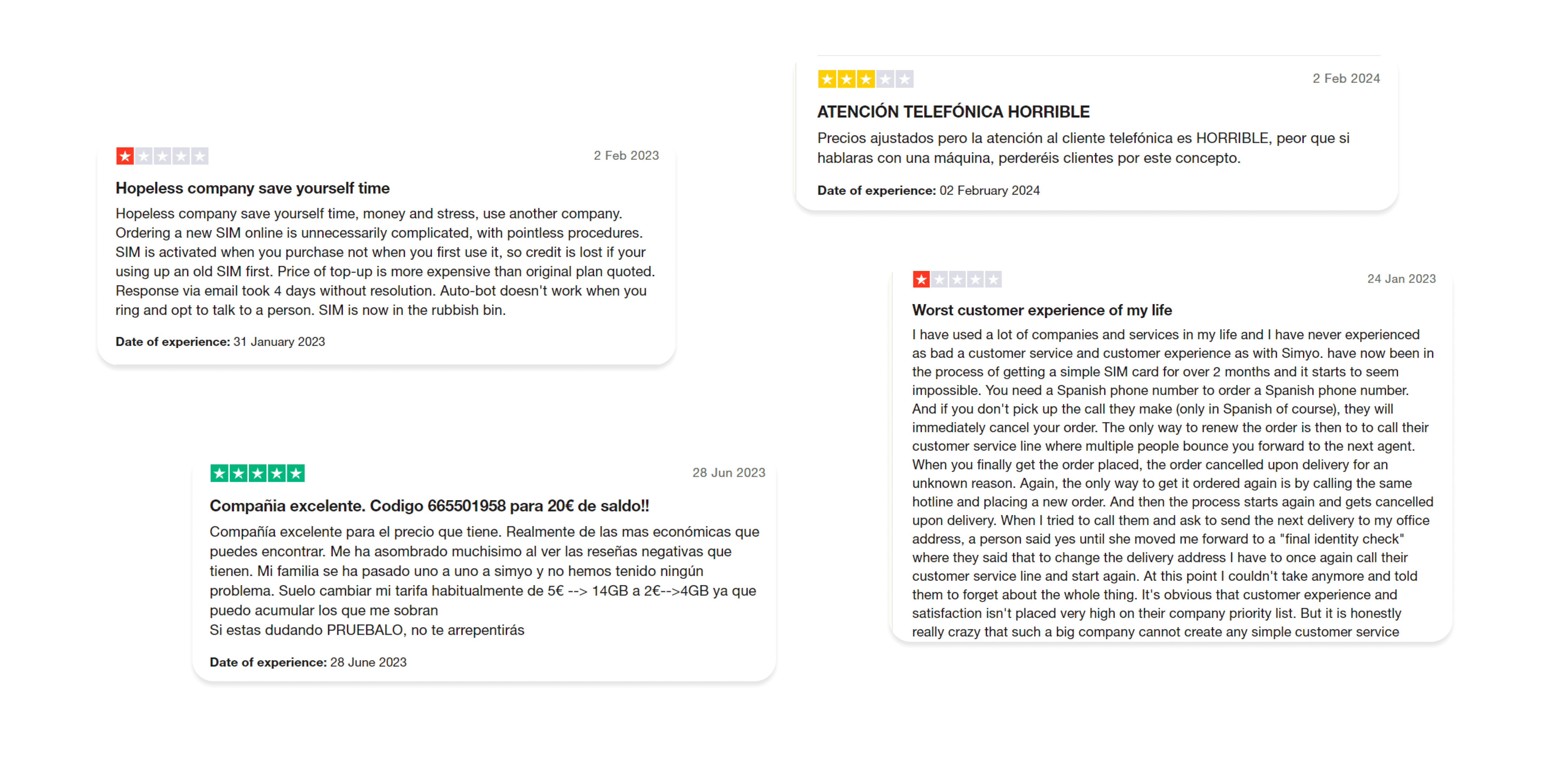
These are only a few of the reviews I encountered. So, I narrowed down the following insights.
Insights
There are clients who trust the company and have had a very pleasant experience
Most customers have had issues with customer service that wasn´t responding -> unable to complete some tasks
Many have had problems with the complexity of the website, and have not been able to choose a plan and therefore place an order
Research on teenagers
The next step was to better understand the type of user this company has. Most of them are made up of young people and students. I needed to better understand what their relationship is with technology and what their expectations are regarding telecommunications depending on their phone use.
I searched several sources and some of the most interesting findings were the following:

Insights
Young people depend a lot on their phones and need a good Internet connection at all times
They want to solve problems themselves if possible
If they have to contact customer service, they prefer other ways to do it and not through talking on the phone
They need to solve their problems quickly
Benchmark
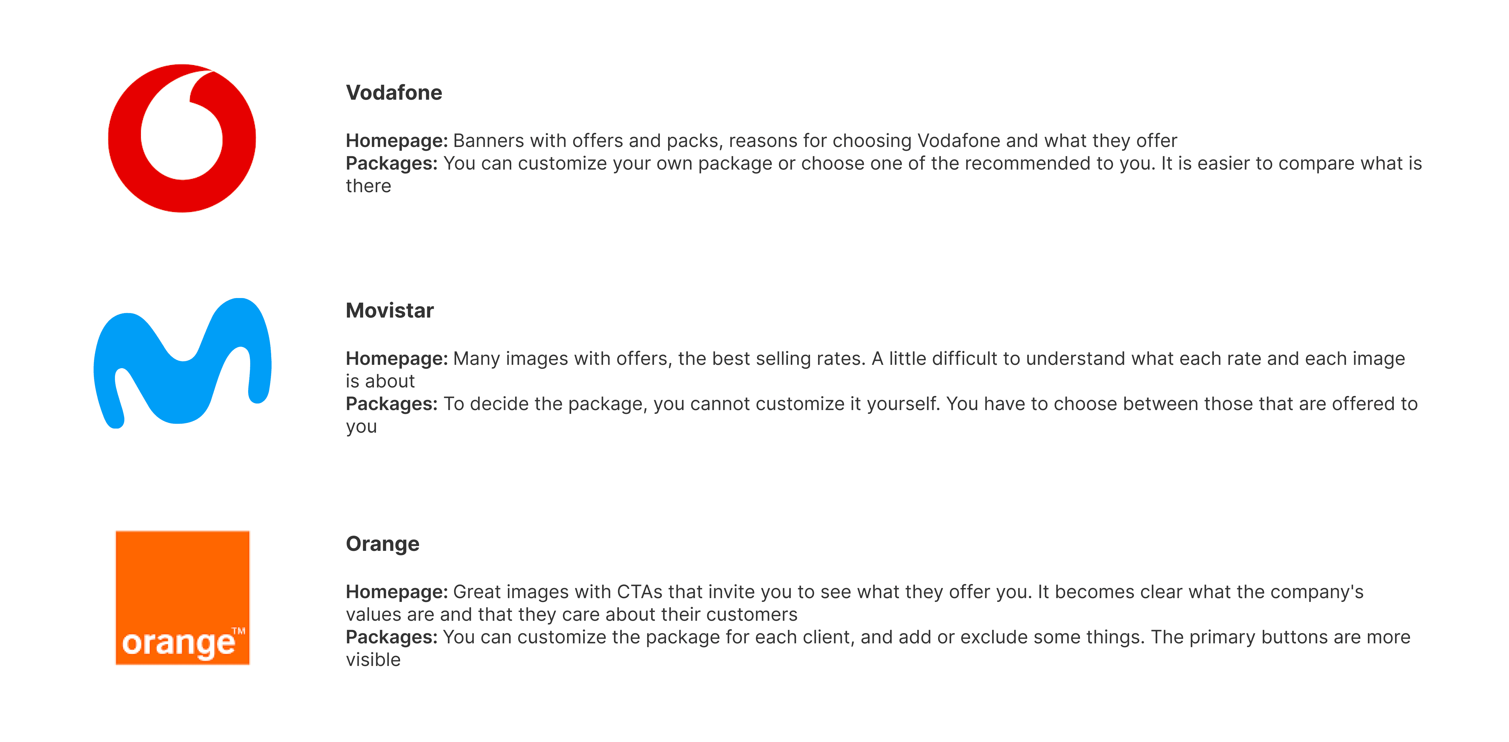
I needed to research what the other companies offer and also do some research on their own websites to see the services they are providing. For this reason, I chose the 3 best-known telecommunications companies in Spain: Vodafone, Movistar and Orange.
Insights
Heuristic's evaluation
Next, I started browsing the Simyo website to better understand how a customer feels for the first time when visiting the site, since I had time limitations and had to detect possible problems in terms of flow, information and heuristics, as soon as possible.
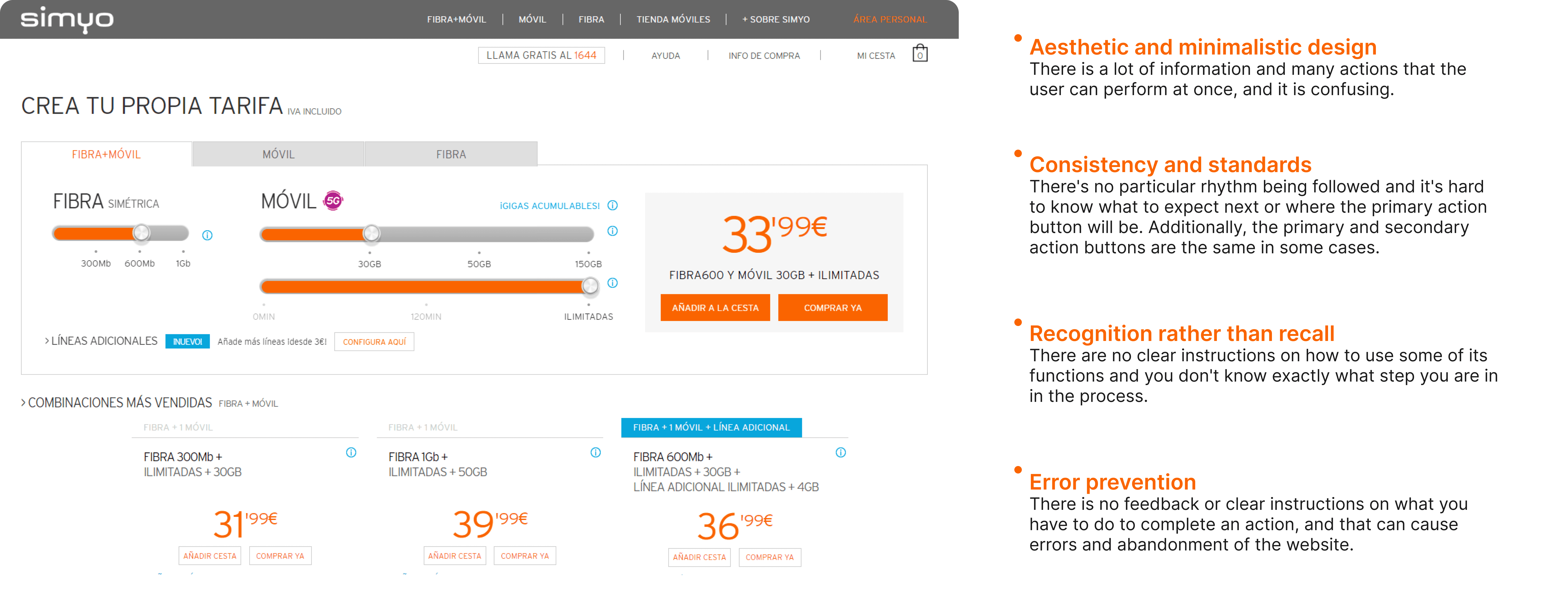
Problem Statement
Simyo customers have trouble navigating the website and as a result, find some simple tasks very complicated or turn to customer service for help. In both cases they end up frustrated and leave the website.
Ideation
Exploration of Idea 1: ChatBot

Based on the research, I wanted to find a solution regarding the insight "Most customers have had issues with customer service that wasn´t responding", as it is keeping customers away from buying products or services, which is the ultimate goal of the company.

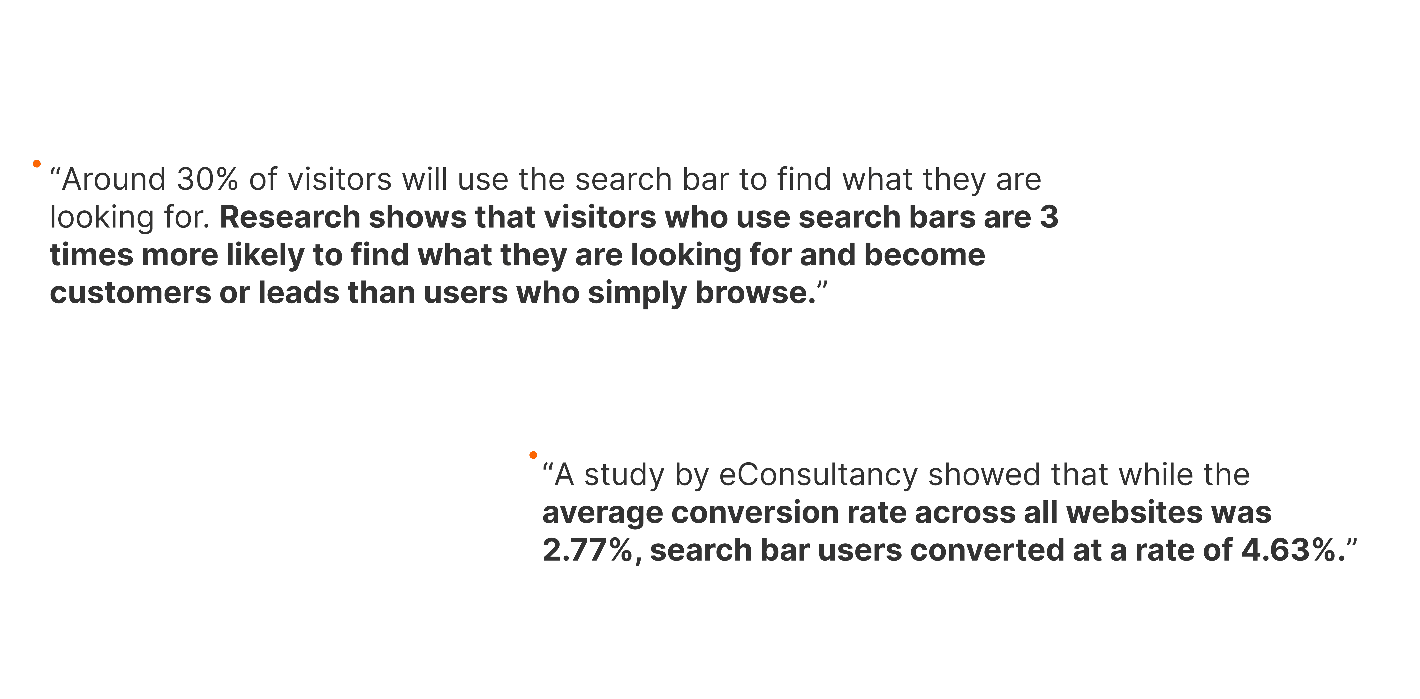
Exploration of Idea 2: Search Bar

Another feature I noticed on competitor websites and which is almost always present on e-commerce websites is the Search Bar. I wanted to explore further its importance and whether it would be necessary on Simyo’s website, and I found that:
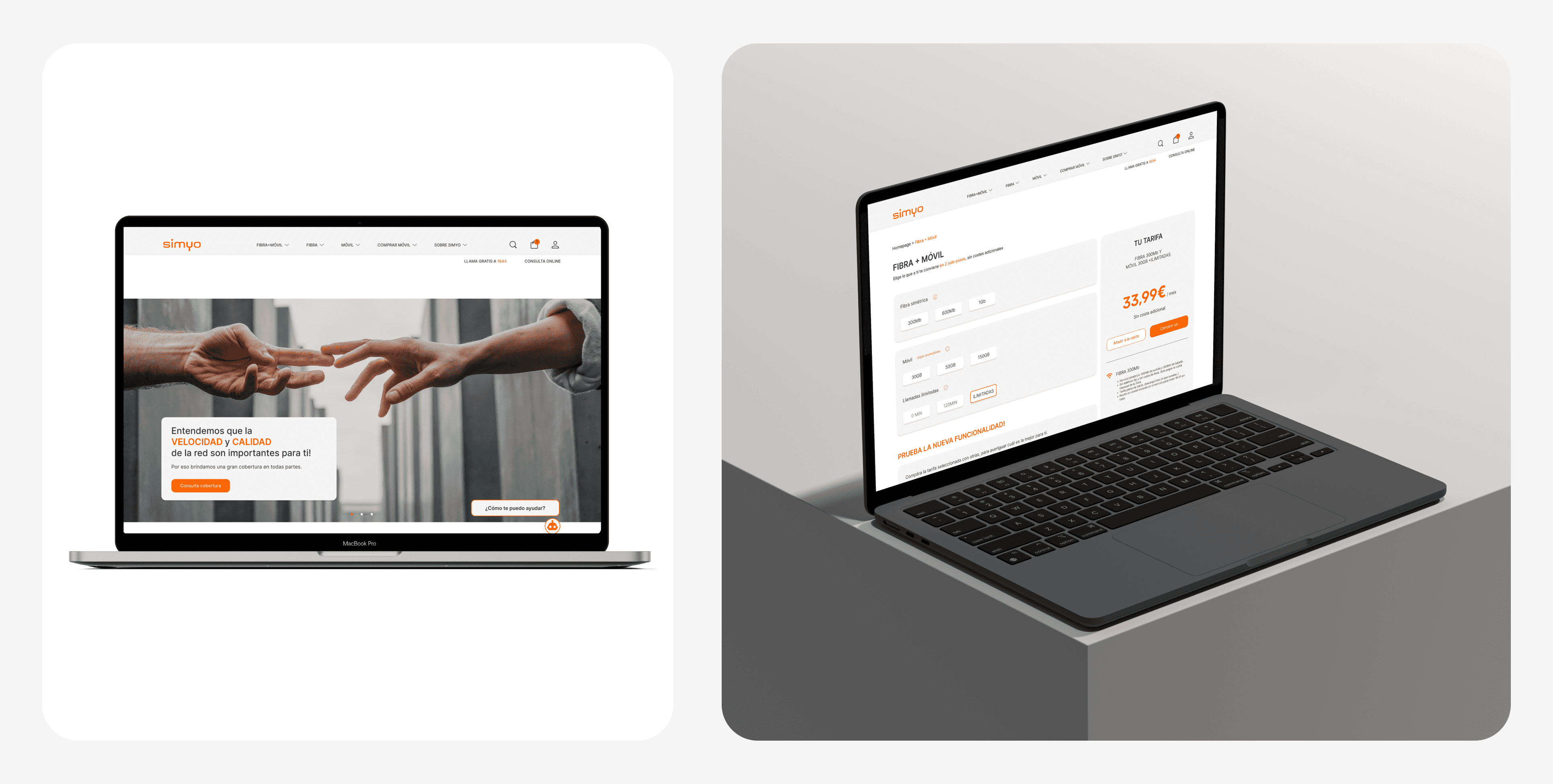
Final design


Next steps
The biggest overall limitation is time. I really had to think about what moves and actions I had to prioritize and that would most efficiently make reach my goals within these 24 hours.
I would have liked to do interviews to get more context on what the real needs of Simyo's customers are.
Also, since this is a first iteration, as a next step I would do usability testing and A/B testing to find out if the solution works with these particular changes and implementations.
Thank you for reading!